Responsive Web Design & SEO – How They Work Perfectly Together
- Webdesign
- July 18, 2025

Overview
Responsive web design and SEO go hand in hand in helping businesses create websites that not only rank well in search engines but also provide a consistent user experience across all devices. In today’s mobile-driven digital world, search engines like Google prioritize factors such as mobile usability, performance, and accessibility - meaning your website’s ability to adapt to different screen sizes directly impacts its ranking.
A responsive website dynamically adapts its layout, images, and content to the device being used – whether smartphone, tablet, or desktop. This reduces user frustration, increases engagement, and aligns perfectly with Google’s ranking signals.
Table of Contents:
- Improved User Experience
- Mobile First Indexing
- Content Optimization
- Why Website Design Needs to Be Mobile-Friendly
- Loading speed is a crucial factor
- The Necessity of Responsive Web Design
- Best Practices for SEO-Friendly Responsive Web Design
- Get an SEO Optimized Responsive Website with Synext IT
- Frequently Asked Questions (FAQ) – Responsive Web Design & SEO
Improved User Experience
User Experience (UX) is one of the most important SEO factors today. A website that looks and works well on all devices ensures:
Lower bounce rates
Longer visit duration
Better interaction with content
More conversions
Responsive design eliminates the need for users to zoom, scroll sideways, or click tiny buttons. Instead, they get an interface that automatically adapts to their screen size and usage situation — exactly what modern users expect. This increases the likelihood that they will stay longer, engage with the website, and return. Such positive user signals have a direct impact on search engine rankings.
Mobile First Indexing
Since 2019, Google has been using what’s known as mobile-first indexing. This means Google primarily evaluates the mobile version of your website when it comes to indexing and ranking.
If your mobile site has fewer contents, metadata, or a different structure compared to the desktop version, it can negatively impact your visibility.
Responsive design solves this problem by ensuring:
The same content is available across all devices
Key SEO elements like meta tags, titles, structured data, and canonical tags remain consistent
No separate mobile website is required, reducing maintenance effort and avoiding duplicates

Does Your Website Need an Upgrade?
With Synext IT, we make your website mobile-friendly, fast, and search engine optimized.
Content Optimization
An often overlooked advantage of responsive design is the optimized presentation of content. When the layout adapts to the screen size, content becomes easier to consume — which positively impacts SEO performance.
Key benefits:
Correct text size and line spacing for mobile devices
Properly scaled and error-free images and videos
Buttons and links that are easy to tap
Content structured for screen readers and mobile users
A responsive layout also reduces the risk of hidden or cut-off content — improving both indexability and accessibility.

Why Website Design Needs to Be Mobile-Friendly
A mobile-friendly website is no longer optional – it’s a necessity. More than 60% of global internet traffic comes from smartphones and tablets. If your website isn’t optimized for smaller screens, users will leave – and Google takes notice.
Essential elements of a mobile-friendly design:
Responsive layout with flexible grids
Easy-to-read fonts and sufficient contrast
Large buttons and tap-friendly areas
Fewer pop-ups and no intrusive ads
Input fields and forms that are easy to fill out on mobile
With responsive design, your website automatically adapts – without needing a separate mobile version, saving effort and ensuring consistency.
Page speed is a crucial factor
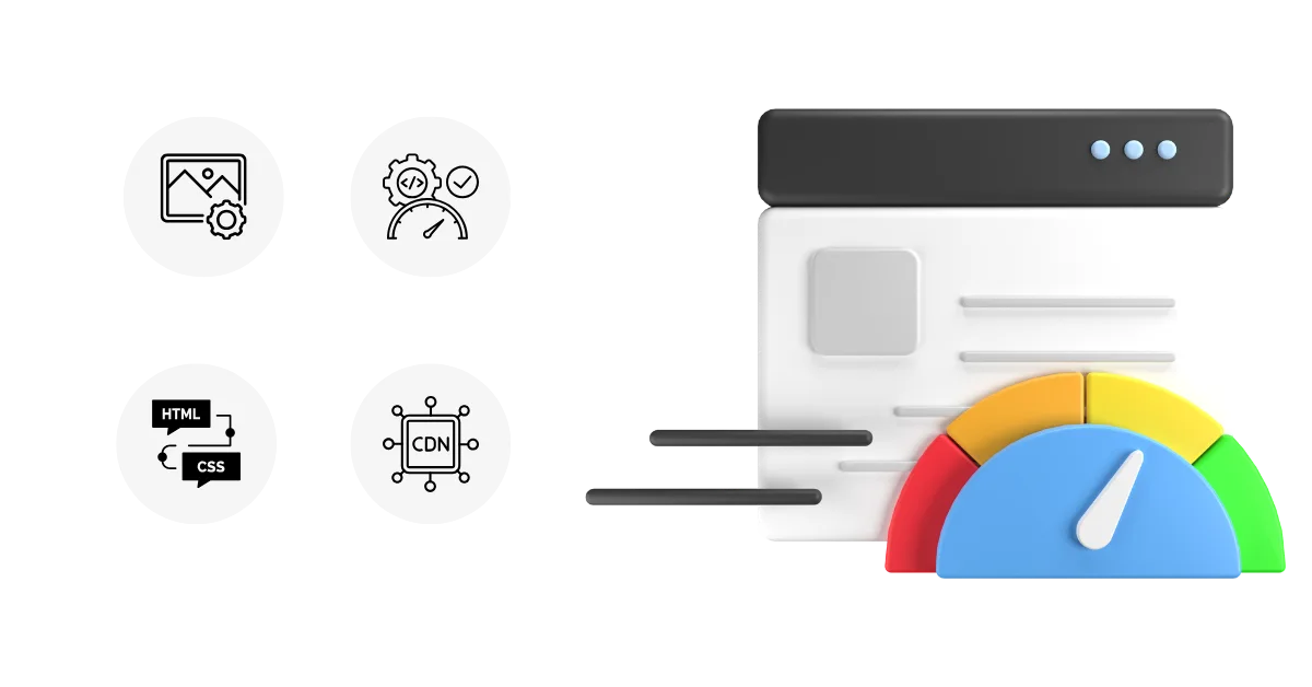
The loading speed of a website is a direct ranking factor in Google’s algorithm. Fast websites perform better because they provide a superior user experience. Slow-loading pages cause users to leave quickly – sending negative signals to search engines.
Properly implemented responsive websites can significantly improve loading times through:
Use of modern programming techniques
Optimized images that adjust to screen size
Lazy loading for images and videos
Clean HTML/CSS code without unnecessary clutter
Use of browser caching and CDNs (Content Delivery Networks)
These measures not only reduce loading times but also support Core Web Vitals – a central part of SEO evaluation from 2024 onward.
Why Responsive Design is Essential
Responsive design is no longer a trend – it’s the standard. Google has explicitly stated that it prefers responsive design over separate mobile URLs or dynamically delivered content.
Why responsive web design is so important:
Reduces bounce rates through better usability and smooth navigation
Consolidates SEO efforts, since no separate mobile URLs need to be maintained
Improves crawlability, as search engines only need to index one version
Future-proof for new device types such as foldables or wearables
Enhances accessibility for screen readers and keyboard navigation
In short: Responsive web design builds trust – with both users and search engines.
Best Practices for SEO Friendly Responsive Web Design

To unlock the full potential of responsive design for your SEO, you should follow these best practices:
Mobile-First Approach: Design for small screens first, then scale up.
Set the Viewport Meta Tag correctly: Ensure proper scaling across devices.
Avoid Flash or non-responsive frameworks: Use modern, flexible technologies instead.
Ensure text size and readability without zoom: Make content easy to read on all devices.
Structure content with semantic HTML5: Improve accessibility and SEO understanding.
Optimize Core Web Vitals (LCP, FID, CLS): Enhance performance and ranking signals.
Test your website on different devices: Use tools like Google’s Mobile-Friendly Test or Lighthouse.
Get Your SEO-Optimized Responsive Website with Synext IT
At Synext IT, we combine modern web design with a well-thought-out SEO strategy to create websites that are powerful, user-friendly, and search engine compliant across all devices.
Our Responsive Web Design Services:
Custom mobile-first layouts tailored to your brand
SEO-friendly structure and optimized metadata setup
Clean code and performance optimization
WCAG and Core Web Vitals compliance
Compatibility with screen readers and keyboard navigation
Ongoing support, monitoring, and SEO optimization
Don’t let an outdated website slow down your rankings or harm the user experience.
Frequently Asked Questions (FAQ) – Responsive Web Design & SEO
What is Responsive Web Design?
Responsive web design refers to a website layout that automatically adapts to the user’s screen size and device. It ensures optimal display and usability on desktops, tablets, and smartphones – without the need for separate mobile versions.
How does Responsive Web Design improve SEO?
Responsive design supports SEO by improving mobile usability, increasing loading speed, and reducing bounce rates. Google favors responsive websites because they provide a consistent user experience and make indexing easier.
Why is mobile-friendliness important?
Over 60% of global website traffic comes from mobile devices. A mobile-friendly, responsive website enables users to easily consume content, navigate pages intuitively, and complete actions – leading to higher engagement and better rankings.
How does Responsive Web Design enhance user experience?
Responsive design ensures clear navigation, readable text, fast loading times, and accessible functionality. These factors reduce frustration, keep visitors on your site longer, and encourage return visits – all positive signals for search engines.
Does Responsive Web Design impact my content marketing strategy?
Yes. A responsive website ensures that blog articles, product pages, and multimedia content display correctly across all devices. This improves visibility, sharing, and engagement – key success factors in content marketing.
What role do design and layout play in SEO?
Your website’s structure affects how search engines crawl and understand content. Clean navigation, logical heading hierarchy, semantic HTML, and responsive design all contribute to stronger SEO and a better user experience.
How do you build an SEO-friendly website?
The following best practices help create an SEO-friendly website:
- Use responsive web design
- Optimize loading speed and images
- Create a clean, crawlable site architecture
- Apply semantic HTML5 tags
- Integrate proper meta tags and structured data
- Ensure mobile usability and accessibility
Can Synext IT help with Responsive Web Design and SEO?
Yes! Synext IT specializes in developing responsive, SEO-optimized websites. Our services include:
- Custom mobile-first layouts
- SEO-optimized structure & performance improvements
- Compliance with Core Web Vitals & WCAG guidelines
- Support for screen readers & keyboard navigation
- Ongoing SEO monitoring & technical support